
 Shop all our fine fragrances
 Salt, Geranium, and Black Amber
 Brazilian Pepper, Cedarwood, Magnolia
 Pomelo, Coriander, Green Leaves
 Sandalwood, Sage, Amber
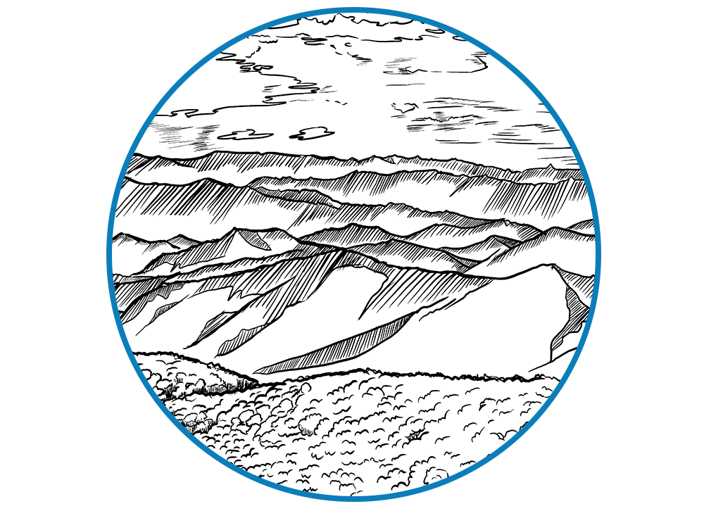
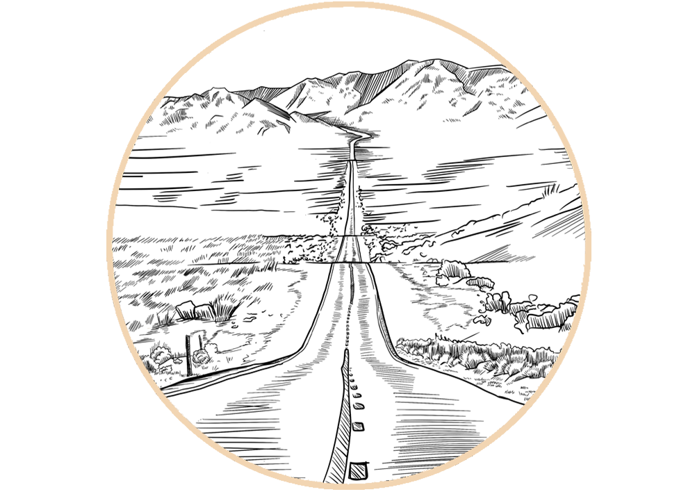
 Coastal, Fresh, Cedar
 Tobacco, Leather, Vanilla
 Atlas Cedar, Neroli, Amber
 5-in-1 fine fragrance oil
 Highly-effective, fine fragrance, aluminum-free deodorant
 Long-lasting, lightly-exfoliating, fine fragrance
 Sets with our Permanent Collection fragranced products
 Rosewood, Ginger, Bergamot
 Highly-concentrated, wax-based, fine fragrances
 Solid Fragrance and Deodorant Refills available
 Balsam Fir, Elemi, Oakmoss
 Incense, Vetiver, Cardamom
 Virginia Cedar, Clary Sage
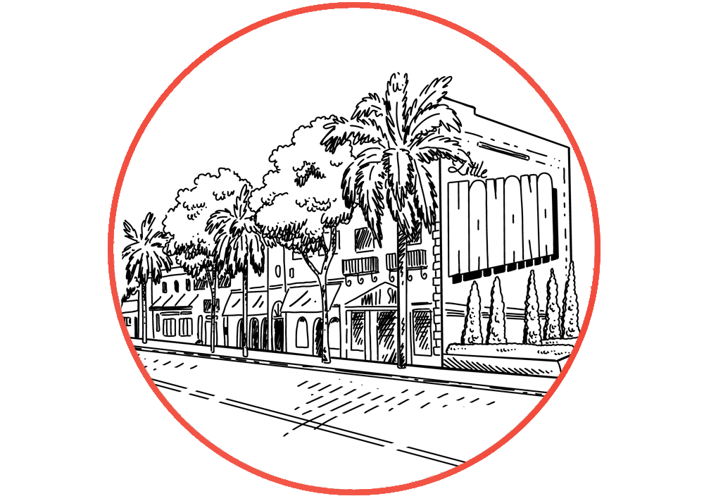 Rum, Tobacco, Sandalwood
 "Virtual Paper"
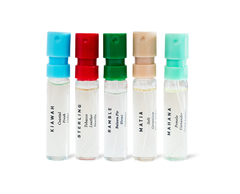 Curated Collection of Fragrance Samples
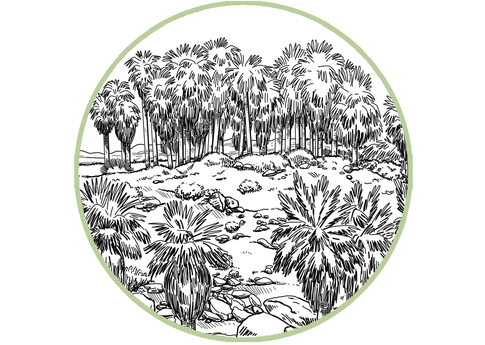
 Desert Wind, Freesia, Myrrh
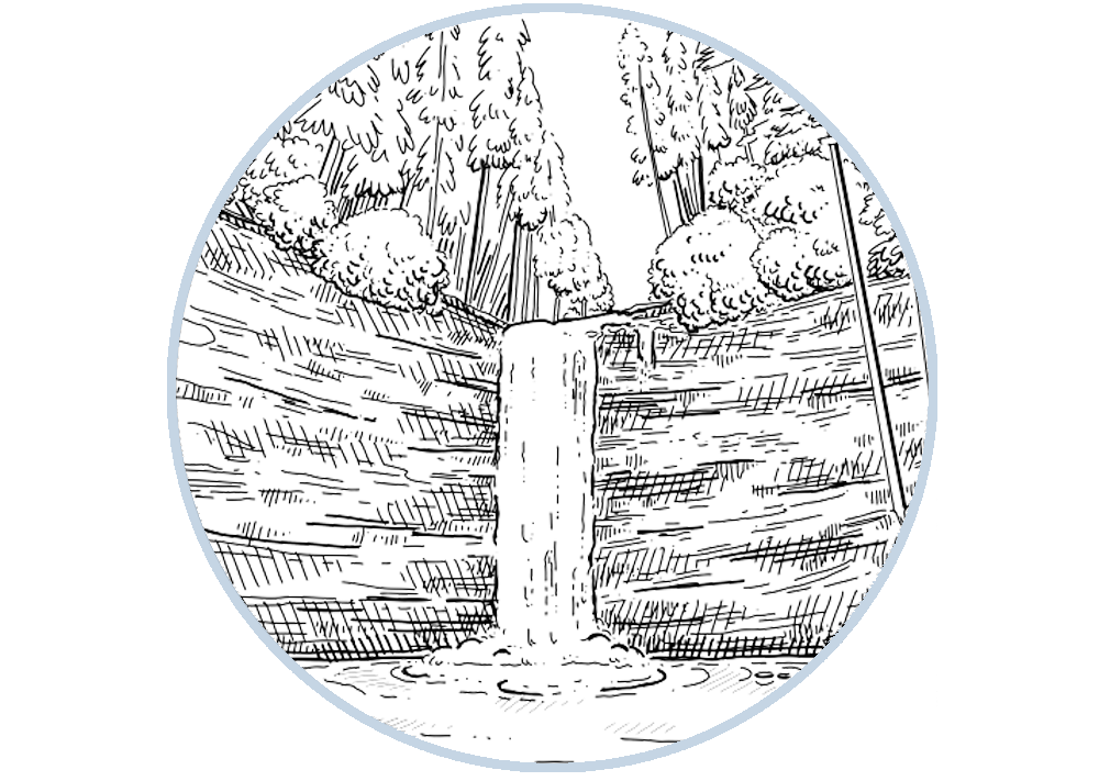 Fresh Rain, Cashmere
 Tuberose, Petitgrain, Patchouli
 Highly-concentrated spray fragrance
Total
$0.00 USD
Happy Ampersand Day! (To be honest, we're just as surprised as you probably are that there is such a thing.) An ampersand is such an insignificant thing that it hardly seems worth celebrating. That’s what we love about it.
At Fulton & Roark, we obsess about the little things. We spend an absurd amount of time on details like identifying the optimum amount of shave cream to best eliminate razor friction, researching the average amount of space in a man’s Dopp kit, and working through the perfect combination of exfoliating ingredients for our bar soap. The truth is, even our very best customers aren’t likely to notice the minutiae that set our products apart, but we know some of you will. For me, focusing on the intricacies and working to get them just right is the best part of working on Fulton & Roark, even if no one notices but us. It's our belief that all of those little things add up to make Fulton & Roark a favorite for our customers.

When it comes to the aesthetic of our overall look, there’s one man who's behind more of the little details than anyone else. José Reyes, the creative director of Metaleap Creative is responsible not only for the design of our ampersand but also for the look and feel of much of our packaging. I asked José how he decided on the specific ampersand that makes Fulton and Roark, “Fulton & Roark,” and this is what he said:
Grooming products a man can trust are the bedrock of Fulton & Roark’s brand. The way we achieved that visually with the brand mark was to look back to Lucian Bernhard’s 1937 typeface masterpiece, Bernhard Modern. Bernhard Modern looks like Fleet Foxes sounds: poetic, timeless, silvery. We took the italic ampersand from that type, and paired it with the sturdier forms of the “F” and “R.” When we did, we got all tingly. That’s when we knew something exciting was about to happen. As far as ampersands go, it’s not the most flamboyant, but its understated elegance has set the tone and spirit of a company that we hope is as long-lasting as the typeface we built it on.
José got the chills from creating what he thought was the perfect combination of fonts and lettering. It’s his passion for getting the little things just right that makes him such a great part of our team, and why we’re so proud to work together. To learn more about José and the whole Metaleap team, follow them on Instagram at @metaleapcreative. To learn more about our mission of fragrance and function, click here.